Executive Dashboards
Give leaders a concise view of business health and exceptions.
- KPIs and trends
- Targets and variance
- Drill-down views
- Role-specific scorecards
Most businesses do not need more data. They need the right information, from the right systems, presented clearly enough that someone can act on it without spending hours assembling a spreadsheet first.
Reporting problems usually show up as time spent gathering information, arguments over whose number is correct, or decisions made after the useful moment has already passed.
Important information is split across software, databases, spreadsheets, and departments.
People spend hours collecting, cleaning, formatting, and distributing recurring reports.
Different teams calculate the same metric differently or work from different versions.
The data exists, but no one sees the exception or trend until after it becomes expensive.
Executives see a high-level number but cannot get to the detail needed to understand why it changed.
A polished chart has little value if the right person does not know what to do differently.
Before choosing visualization tools, we define what the user is trying to know, what action that information should support, and how current the data needs to be.
Give leaders a concise view of business health and exceptions.
Help teams manage today’s work rather than only review last month.
Generate and distribute recurring information without spreadsheet assembly.
Combine information that no single application can show on its own.
Use established reporting tools when they fit the requirement.
Build a tailored experience when reporting is part of a larger workflow.
Many businesses need both.
Best for monitoring.
Shows the current state, trends, exceptions, and the few measures people need to watch repeatedly.
Often the strongest combination.
See the issue quickly, then drill into the records, transactions, locations, people, or time periods behind it.
Best for analysis or distribution.
Provides detailed information for review, audit, scheduled delivery, printing, export, or a specific business question.
Before a KPI becomes a dashboard tile, the business needs agreement on what it means, where it comes from, and how it is calculated. Reporting projects often uncover inconsistent definitions and data-quality issues that were hidden inside manual spreadsheets.
That is useful work. A dashboard that makes a bad metric faster does not improve decision-making.
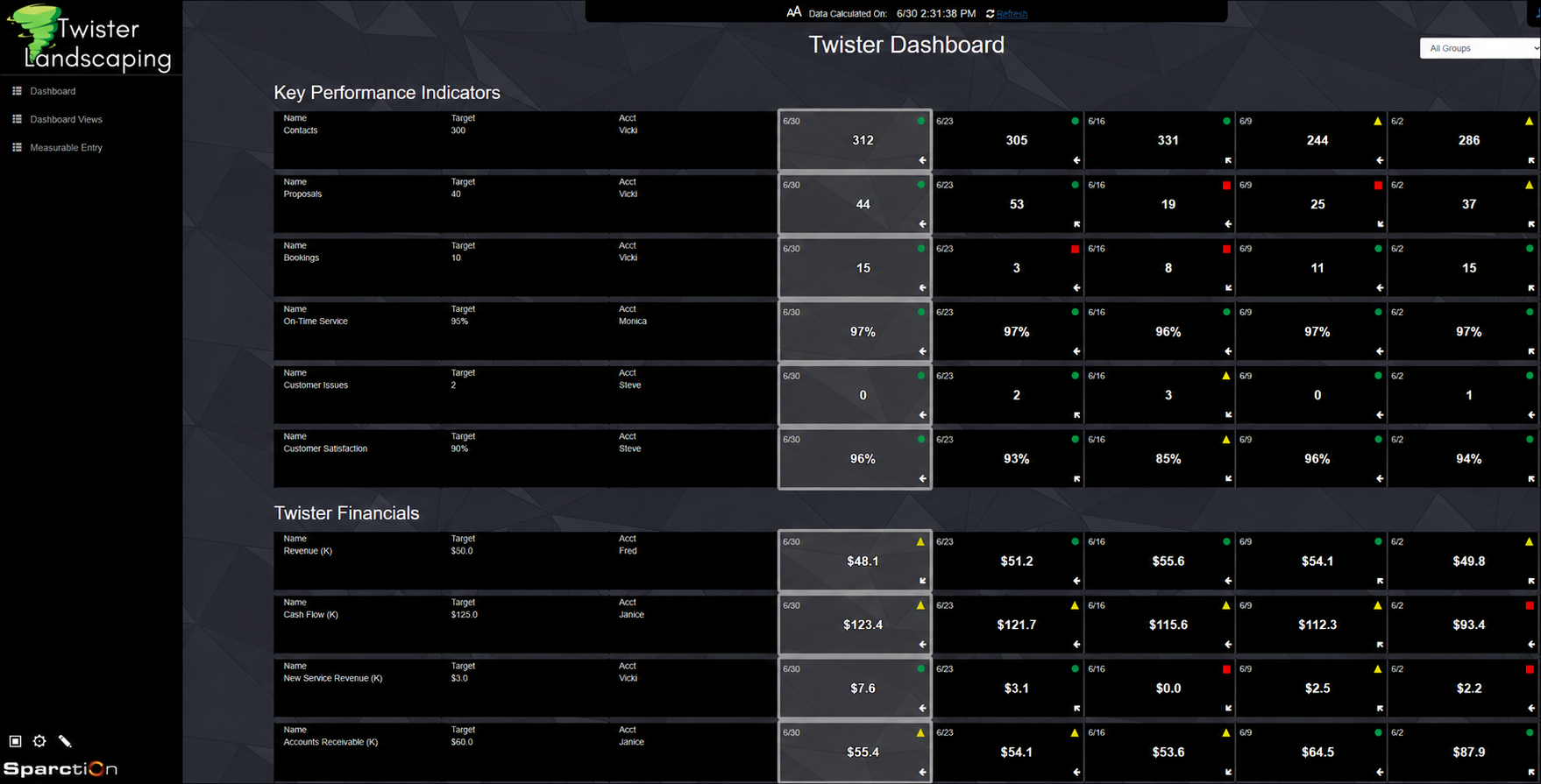
A custom scorecard brings operational and financial KPIs into one place, making targets, trends, and potential problems easier to see and act on.
“We are extremely pleased with the partnership we’ve developed with Tornado Technologies. In developing a customized Excel-based tool, the Tornado team delivered thoughtful, creative solutions and consistently demonstrated a willingness to think beyond conventional approaches. Having worked with several IT software firms, Tornado clearly stood out for their creativity, collaboration, and problem-solving approach. The result is an outstanding solution that significantly enhances efficiency and expands the capabilities of our service teams. Additionally, the team was highly responsive throughout the project and delivered the solution on time and on budget.”
The value comes from better visibility, less manual reporting effort, and faster action—not from adding more charts.
Give leadership a consistent view of performance, targets, trends, and exceptions.
Show status, throughput, backlog, WIP, downtime, or other operational measures.
Replace recurring spreadsheet assembly with scheduled, consistent information.
Combine information from systems that were never designed to report together.
Surface the people, transactions, or events that need attention instead of reviewing everything.
Give customers secure access to the information, status, or performance data relevant to them.
Almost any information that can be stored, tracked, or measured can be turned into a report or dashboard.
We’ve helped organizations create executive scorecards, KPI dashboards, production reports, inventory reports, sales dashboards, financial summaries, compliance reports, project tracking dashboards, and many other reporting solutions.
Some reports focus on detailed information needed for day-to-day operations. Others provide high-level summaries that help managers and executives monitor performance and make decisions quickly.
Reports and dashboards can also combine information from multiple systems. For example, a manager might want to see sales data from a CRM, production information from a manufacturing system, and financial data from an accounting package all in a single view.
One thing we’ve learned over the years is that the most valuable reports don’t simply display information. They influence behavior.
For example, we worked with a healthcare organization that wanted to improve compliance with internal best practices. Initially, we created an on-demand report that showed overall compliance levels across the organization. While useful, it had only a modest impact. Later, we modified the report to show individual compliance ratings and automatically emailed the results to staff each day. That simple change significantly improved overall performance because people could clearly see how they were doing and where improvements were needed.
The best reports and dashboards don’t just answer questions. They help organizations make better decisions, identify opportunities, and drive meaningful action.
One of the most common reporting challenges organizations face is that important information is spread across multiple systems. Sales data may reside in a CRM, financial information in an accounting package, production data in a manufacturing system, and operational metrics in spreadsheets or custom applications.
When those systems operate independently, managers often spend significant time exporting data, combining spreadsheets, reconciling numbers, and trying to determine which version of the information is correct.
A well-designed reporting solution can often bring that information together into a single dashboard or report, providing a more complete view of the business without requiring users to jump between multiple applications.
For example, a company might want to view sales, production, and profitability metrics together even though the information originates from different systems. By combining those data sources into a unified dashboard, management can make decisions using a more complete picture of what’s happening across the organization.
In some cases, combining information from multiple systems is actually more valuable than improving any individual report. The most useful insights often come from seeing how different parts of the business relate to one another rather than viewing each system in isolation.
The goal isn’t simply to collect more data. The goal is to give decision-makers a clear, accurate view of the information they need to run the business effectively.
Most reporting and dashboard projects fall into one of three ranges:
Focused Reporting Projects: $2,000–$5,000
Management Dashboards: $5,000–$15,000
Enterprise Reporting Solutions: $15,000–$50,000+
Focused projects typically involve a small number of reports, dashboards, or KPIs sourced from one or two systems. Management dashboards often combine information from multiple systems, provide role-specific views, or include automated distribution and alerts. Enterprise reporting solutions may involve large amounts of data, complex calculations, numerous dashboards, or organization-wide reporting requirements.
The biggest factor affecting cost is usually not the number of charts or reports being created. It is the effort required to gather, organize, validate, and present the information in a way that helps people make better decisions.
Many organizations find that reporting projects deliver value quickly because they help identify inefficiencies, improve visibility, reduce manual reporting effort, and support better decision-making throughout the organization.
We also build frequent reviews and status updates into every reporting project. That keeps both sides aligned throughout the process, helps validate that the information being presented is accurate and useful, and makes it much easier to catch and address issues early rather than discovering them at the end.
The best way to estimate cost is to start with the business questions you are trying to answer. Once we understand the information you need and where that information currently resides, we can recommend the most practical reporting solution and provide a realistic estimate.
The right choice depends on what problem you’re trying to solve.
Power BI is an excellent reporting platform, and in many cases we recommend it.
In fact, some of the reporting solutions we develop for clients are built using Power BI. It provides powerful visualization tools, interactive dashboards, and strong integration with Microsoft products.
However, Power BI is a reporting tool, not a complete solution by itself.
The bigger question is often where the data comes from, how it is organized, how key metrics are calculated, and what information decision-makers actually need. Those challenges exist regardless of whether the final dashboard is built in Power BI, a custom web application, or another reporting platform.
There are situations where Power BI is the ideal choice. There are also situations where a custom dashboard may provide a better user experience, tighter integration with business processes, role-based views, mobile access, data entry capabilities, or features that go beyond reporting alone.
Another consideration is licensing. Depending on how many users need access and how reports are distributed, Power BI licensing costs can become a meaningful part of the overall investment. A custom reporting solution may have a higher upfront development cost but often does not require per-user reporting licenses, making it an attractive option for some organizations.
Our approach is to start with the business problem rather than the technology. Once we understand your goals, users, data sources, and reporting requirements, we can recommend the most practical solution. Sometimes that’s Power BI. Sometimes it’s a custom dashboard. In many cases, it’s a combination of both.
The goal is not to choose a particular reporting tool. The goal is to provide the visibility your team needs to make better decisions and run the business more effectively.
The answer depends on how the information will be used.
A report is typically designed to answer a specific question or provide detailed information. Reports are often printed, exported, emailed on a schedule, or reviewed periodically. For example, a weekly sales summary, monthly financial report, or inventory valuation report would all be considered reports.
A dashboard is designed to provide ongoing visibility into the health of the business. Dashboards typically present key metrics, trends, and performance indicators in a visual format that allows users to quickly understand what is happening and where attention may be needed.
In many organizations, the best solution is not choosing one or the other. It’s using both together.
For example, an executive dashboard might highlight declining profit margins or increasing production downtime. A detailed report can then help users investigate the underlying causes and identify opportunities for improvement.
We’ve found that dashboards are often best for monitoring performance, while reports are often best for analysis and decision-making. The right combination depends on your goals, your users, and how the information will be used within the organization.
Our goal is not to force a particular reporting format. It’s to make sure the right information is available in the right format for the people who need it.
The best place to start is not with the metrics. It’s with the decisions you need to make.
Many organizations begin a reporting project by asking for dozens of KPIs, charts, and reports. The challenge is that more information does not always lead to better decisions. In fact, too much information can make it harder to identify what really matters.
Instead, we typically begin by asking questions such as:
What are your most important business goals?
What problems are you trying to solve?
What decisions do managers need to make regularly?
What information do you wish you had today?
Once those questions are answered, the most useful metrics often become much clearer.
For example, a production manager may care about throughput, downtime, scrap rates, and on-time delivery. A sales manager may focus on pipeline activity, close rates, and revenue trends. An executive may want a higher-level view of profitability, growth, cash flow, and overall business performance.
We’ve found that the most effective dashboards tend to focus on a relatively small number of meaningful metrics rather than trying to display everything at once. The goal is not to create more reports. The goal is to help people quickly understand what is happening, identify areas that need attention, and make better decisions.
A well-designed dashboard should allow someone to look at it and immediately know whether things are on track, where attention is needed, and what questions should be investigated further.
Spreadsheets are incredibly useful tools, and in many situations they may be exactly the right solution.
For smaller organizations, one-time analyses, ad hoc reporting, and situations where data changes infrequently, spreadsheets can often provide everything that’s needed. We regularly use spreadsheets ourselves and are not opposed to them.
The challenge usually begins when spreadsheets become the primary reporting system for the organization.
When employees spend hours exporting data, manually updating formulas, combining information from multiple sources, or emailing different versions of reports back and forth, reporting can become time-consuming and prone to errors. As the business grows, maintaining those spreadsheets often becomes more difficult and more dependent on a small number of people who understand how everything works.
A reporting or dashboard solution can help automate much of that effort by pulling information directly from the source systems, presenting it consistently, and making it available to the people who need it without requiring manual preparation each time.
The goal is not necessarily to replace spreadsheets. In many cases, spreadsheets continue to play an important role. The goal is to determine whether your team is spending more time preparing information than actually using it to make decisions.
If that’s happening, it may be time to consider a different reporting approach.
Most reporting projects don’t fail because of technology. They fail because the reports don’t provide information that people actually use to make decisions.
We have seen this enough times that it directly shaped how we work.
One common mistake is starting with charts, graphs, and metrics before clearly defining the business questions that need to be answered. It is surprisingly easy to create dashboards that look impressive but don’t help managers take meaningful action.
Another challenge is trying to measure too many things at once. When a dashboard becomes cluttered with dozens of KPIs, users often struggle to identify what is important and where attention should be focused. In many cases, a smaller set of meaningful metrics is more valuable than a large collection of data.
We have also found that reporting projects are most successful when the people who will use the reports are involved throughout the process. That is why we build frequent reviews and status updates into every project rather than disappearing for weeks and returning with something that missed the mark. Managers, supervisors, and employees often have valuable insights into what information is truly useful and what simply creates noise, and those insights are far easier to act on when they surface early.
Finally, reports are only as useful as the data behind them. If information is incomplete, inconsistent, or collected differently across departments, even the most attractive dashboard can produce misleading results. Validating the data and agreeing on how key metrics are calculated is an important part of every reporting project.
The best reporting projects begin with clear business objectives, focus on a manageable number of meaningful metrics, and provide information that helps people make better decisions. That is the approach we bring to every engagement.
Not necessarily.
One of the most common misconceptions we encounter is that poor reporting automatically means a company needs new software. In reality, many organizations already have the data they need. The challenge is accessing it, organizing it, and presenting it in a way that supports better decision-making.
In many cases, we can build reports and dashboards using information from your existing systems without requiring a major software replacement. This may involve connecting directly to databases, combining information from multiple applications, or creating a reporting layer that sits on top of the systems you already use.
For example, we worked with a trucking company that believed they needed an entirely new application because management couldn’t get the information they needed. After evaluating the situation, we discovered the existing system already contained the necessary data. The real issue was the lack of meaningful reporting. By creating a reporting solution that leveraged the existing system, they were able to gain the visibility they needed at a fraction of the cost of replacing the software.
That doesn’t mean software replacement is never the right answer. Sometimes a system has limitations that make modernization worthwhile. However, we believe it’s important to understand the real problem before recommending a solution.
Our goal is to help you determine the most practical and cost-effective path forward, whether that’s better reporting, system integration, software modernization, or something else entirely.
Not only is that possible, it is usually the approach we recommend.
We often suggest starting with the information that is most important for making decisions today. That might be an executive dashboard, a production scorecard, a sales report, or a KPI summary for a specific department. Once those reports are in use and providing value, additional reports and dashboards can be added over time.
Starting small offers several advantages. It allows users to become comfortable with the reporting solution, helps validate that the information being presented is useful, and often reveals additional opportunities that weren’t obvious at the beginning of the project.
We have also found that once people begin using reports regularly, they often discover new questions they would like answered. Those insights can lead to future enhancements that are far more valuable than trying to anticipate every requirement upfront.
The goal is not to build every report your organization might ever need. The goal is to deliver useful information quickly and then evolve the reporting solution as your business needs change.
The timeline depends on the complexity of the reports, the number of data sources involved, and the quality of the underlying data. Here are realistic ranges to set expectations:
Focused Reporting Projects: One to three weeks
Management Dashboards: One to three months
Enterprise Reporting Solutions: Several months or longer
Simple reporting projects that draw information from a single system can often be completed surprisingly quickly. More advanced dashboards that combine information from multiple systems, calculate complex KPIs, or support multiple departments naturally require additional planning, development, and testing.
One factor many organizations overlook is that the biggest challenge is often not building the report itself. It is agreeing on the definitions behind the numbers. For example, departments sometimes calculate the same KPI differently or have different expectations about how information should be presented. Resolving those questions early helps ensure everyone trusts the final results.
Rather than waiting for every report to be completed before anything goes live, we build frequent reviews into every project and deliver reports incrementally as they are completed. That allows your team to begin using and providing feedback on early reports while development continues, which almost always leads to a better end result.
The projects that move fastest typically have clearly defined objectives, knowledgeable stakeholders, and a good understanding of where the required data resides. During the planning phase, we will evaluate your reporting goals, identify potential challenges, and provide a realistic timeline based on your specific requirements.
Yes. In fact, role-based reporting is often one of the most valuable features of a reporting solution.
Different people in an organization typically need different information to do their jobs effectively. An executive may want a high-level view of profitability, growth, and key performance indicators. A department manager may need operational metrics and team performance data. Frontline employees often need detailed information related to their specific responsibilities.
Rather than showing everyone the same reports, dashboards can be tailored to display the information that is most relevant to each role. This helps users focus on what matters most while reducing unnecessary complexity and information overload.
Role-based reporting can also be difficult to achieve with spreadsheets. In many organizations, a single spreadsheet contains information intended for multiple audiences. While it is possible to hide rows, columns, or worksheets, managing different views often becomes cumbersome as reporting needs grow. Dedicated reporting and dashboard solutions make it much easier to present the right information to the right people without requiring users to sort through data that isn’t relevant to them.
Role-based reporting can also support security and confidentiality requirements. Financial information, employee performance data, customer details, and other sensitive information can be limited to the people who need access to it.
We’ve found that reporting solutions are often most successful when users can quickly find the information they need without having to sort through data that isn’t relevant to their responsibilities.
The goal is to provide the right information to the right people at the right time so they can make better decisions and take action more quickly.
Accurate reporting starts with accurate data.
Before building reports or dashboards, we spend time understanding where the information comes from, how it is collected, and how key metrics are calculated. This helps ensure that everyone is working from the same definitions and expectations.
One of the most common reporting challenges occurs when different departments calculate the same metric differently. For example, sales, operations, and accounting may each have their own interpretation of a KPI. If those differences are not identified early, reports can create confusion instead of clarity.
We validate the data sources and reporting logic throughout the project by scheduling regular reviews with stakeholders and comparing results against existing reports. That ongoing communication helps us identify discrepancies and resolve them while they are still easy to fix rather than after reports are already being relied upon for decision-making.
Another advantage of automated reporting is consistency. When information is pulled directly from source systems, organizations can reduce many of the manual steps that often introduce errors into spreadsheet-based reporting processes.
Ultimately, the goal is not just to create reports that look correct. It is to create reports that decision-makers trust. When people have confidence in the numbers, they spend less time debating the data and more time using it to improve the business.
Yes, and in many cases automated delivery is just as important as the report itself.
Reports can often be delivered automatically by email, generated on a schedule, published to dashboards, or made available through secure web and mobile interfaces. Depending on the situation, reports may be delivered daily, weekly, monthly, or whenever specific business events occur.
For example, managers may receive a daily operational summary each morning, executives may receive a weekly KPI scorecard, or sales teams may receive performance reports at the end of each week. Automated delivery helps ensure that important information is consistently available without requiring someone to manually prepare and distribute reports.
We’ve also found that automated delivery can significantly increase the impact of reporting. In one project, a healthcare organization initially used an on-demand compliance report that employees could view whenever they wanted. After modifying the solution to automatically email individual compliance results each day, overall performance improved significantly because the information became more visible and actionable.
The goal is not simply to create reports. The goal is to ensure that useful information reaches the people who can act on it.
Most reporting solutions continue to evolve long after they are first deployed.
As your business changes, you may want to add new KPIs, incorporate additional data sources, create reports for new departments, modify calculations, or improve how information is presented. Reporting needs often grow as organizations gain more visibility into their operations and discover new opportunities for improvement.
We provide ongoing support, maintenance, and enhancement services to help clients continue getting value from their reporting investment. Some clients engage us regularly to expand and refine their dashboards over time, while others contact us only when they need assistance or want to add new capabilities.
We’ve found that many of the best reporting ideas emerge after people begin using the reports. Once managers and employees have access to better information, they often identify additional questions they would like answered or opportunities they would like to track.
Our goal is to create reporting solutions that can grow and adapt with your business rather than becoming outdated as your needs change.
And if you ever decide to use another support provider, that’s your choice. The goal is to help you gain better visibility into your business, not to create dependency on Tornado Technologies for future support.
Start with the business question—not the chart. We can help determine where the data lives, how trustworthy it is, and the simplest way to make it useful.
Schedule A Call